What I've done!
- Led and organized the team to interview 17 stakeholders and redesign the city portal through reconstruction of the information architecture.
- Referenced up to 9 other city web portals and collected services scattered among them, and reorganized a total of 24 service labels into different granularity.
Overview
In the summer of 2020, I redesigned the city-government portal of Keelung City, a city with a population of about 400,000 people. It was an intern project directed by the Digital Minister of the Executive Branch of Taiwan, Audrey Tang. This granted me the opportunity to dig into the real-world chaos in its website's structure and discovered my fondness for information architecture.
We figured out the existing gap was that users could not intuitively understand the service that each department provided, or even which department provided which service. To solve the issues, we dug deeper into the existing information architecture. Eventually, we came up with a redesigned information architecture along with the new design after several iterations to make this website more user-friendly.
We tried to have several techniques applied during the practice into our design. I will be sharing the procedure, motives and concerns and how it worked out helping the process as a whole. In addition, this was the first time I implemented my vision into products. After having infused so much effort and passion, this project further inspired me to curate my IA workflow system, which was later applied to another organization and the redesign flow.
Preliminary Discussion
- Noisy in the information provided.
- High complexity of website structure: making it hard for users to find services needed.
- Inaccurate in its labeling.
- User-unfriendly: complicated design in the structure. (e.g., Several steps are needed in order to finally reach the service wishing to have.)
- The portal website constructed organization-oriented: difficult to distinguish important information.
- Listed services were not users' highest priority.
Research Highlights
Highlight 1: Two paths of visiting: service-based & role-based
While some users entered the portal having a specific service to reach out in their mind; we noticed that some other visitors don't always have such concrete goals, entering the website just to browse around; therefore, a service-based IA for government portals may not fit their needs.
To address this kind of use case, we included a role-based design that users can categorize themselves (e.g., as travelers to City K vs. residents) at the beginning of the navigation process and thereafter see services provided to them accordingly.
Highlight 2: Physical Toolkit Developed

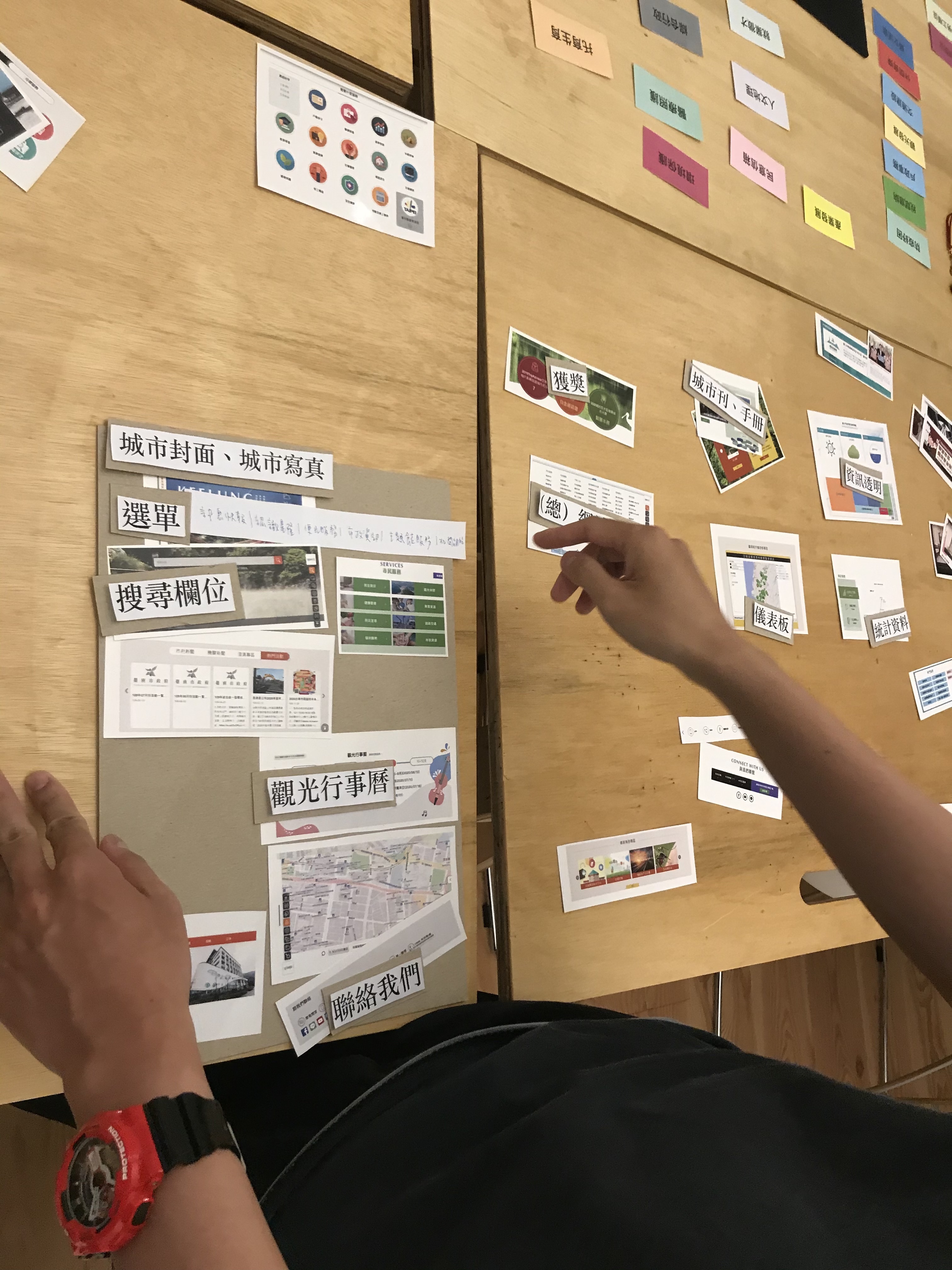
In order to let our users arrange their expected form of design, we designed a toolkit to have them choose among the components they wanted to see and place them on the board.
The shown are component artifacts collected from different city portals for the users to choose from, and the board was for users to work on their ideal website layout and components-to-include.
Highlight 3: Online Toolkit Developed

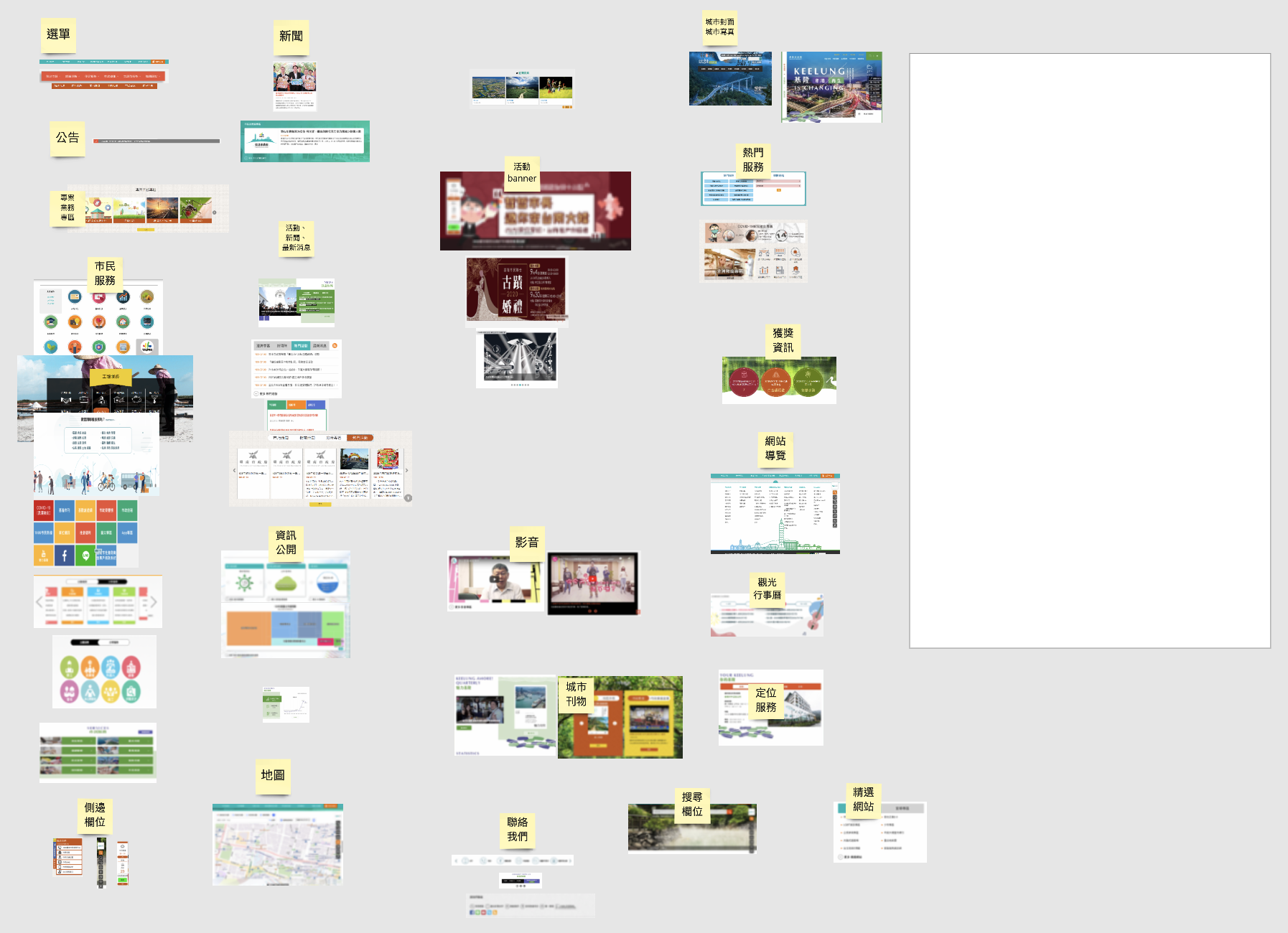
During the pandemic, we made it an online toolkit so that our users could operate with it during online interviews beyond the limitation of not being face-to-face.
N.B. The white area was the artboard for users to work on their ideal website layout and components-to-include.
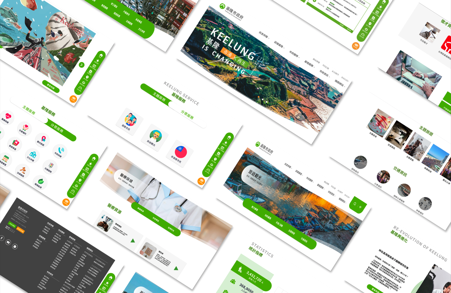
Final Design
Results
Through the fixation of IA, dealing with complications including overlapping, inefficient listing of services, and different granularity of levels items enumerated. We referenced 9 other city web portals and broke down various web components to provide a list of derived components, and then reorganized a total of 24 service labels into different granularities.


